Actionable Card Widgets
Self‐contained workspaces that eliminate context switching.
In this page
November 16th, 2025
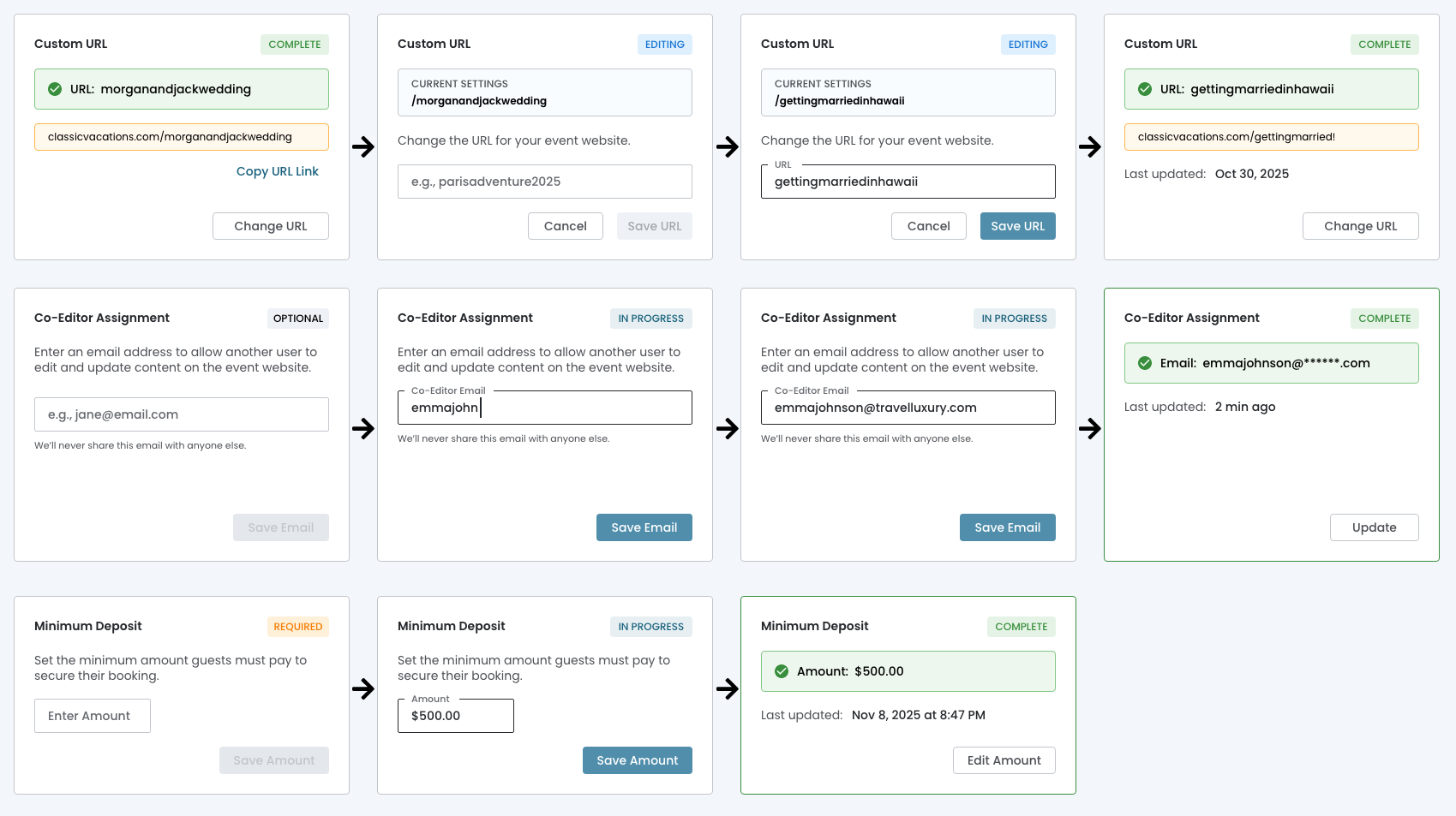
Card‐based Architecture
Self-contained, Stateful widget
Rather than navigating to separate pages or interrupting workflow with modal overlays, users complete tasks directly within the card interface. Each card transforms between:
- View State
- Edit State
- Validation State
This maintains the user's position within the dashboard by keeping all contextual information visible, provides immediate visual feedback through state badges and creates a fluid, friction‐free experience.
November 16th, 2025
Progressive Disclosure
Inline Editing Cards
Cards reveal only the controls needed for the current task state, preventing interface overwhelm while maintaining quick access to editing capabilities. The card is both the trigger AND the destination!
- State Transitions Are Obvious
- Empty state → shows placeholder + "Save Email" (disabled)
- Editing state → shows input field + active "Save Email" button
- Complete state → shows confirmed data + "Update" button
- The Card Container Remains Constant
- Same visual boundaries
- Same position in the grid
- Only the internal content changes
- Action Buttons Live ON the Card
- "Change URL", "Save Email", "Edit Amount" are embedded
- Not "View Details" or "Manage" (which imply navigation)