Layout Specifications
Establish a balanced approach between content accessibility and luxury brand presentation ensuring optimal readability.
In this page
September 18th, 2025
Structural Width Constraints
Hybrid Approach
Full‐Width & Constrained‐Width
The layout system employs a hybrid approach with both full‐width elements for visual impact and constrained‐width content areas for enhanced user experience.
All specifications are designed with mobile‐first responsive principles, automatically adapting to provide the best viewing experience across desktop, tablet, and mobile devices.
Understanding these layout parameters is essential for maintaining design consistency and ensuring proper implementation of the responsive framework.
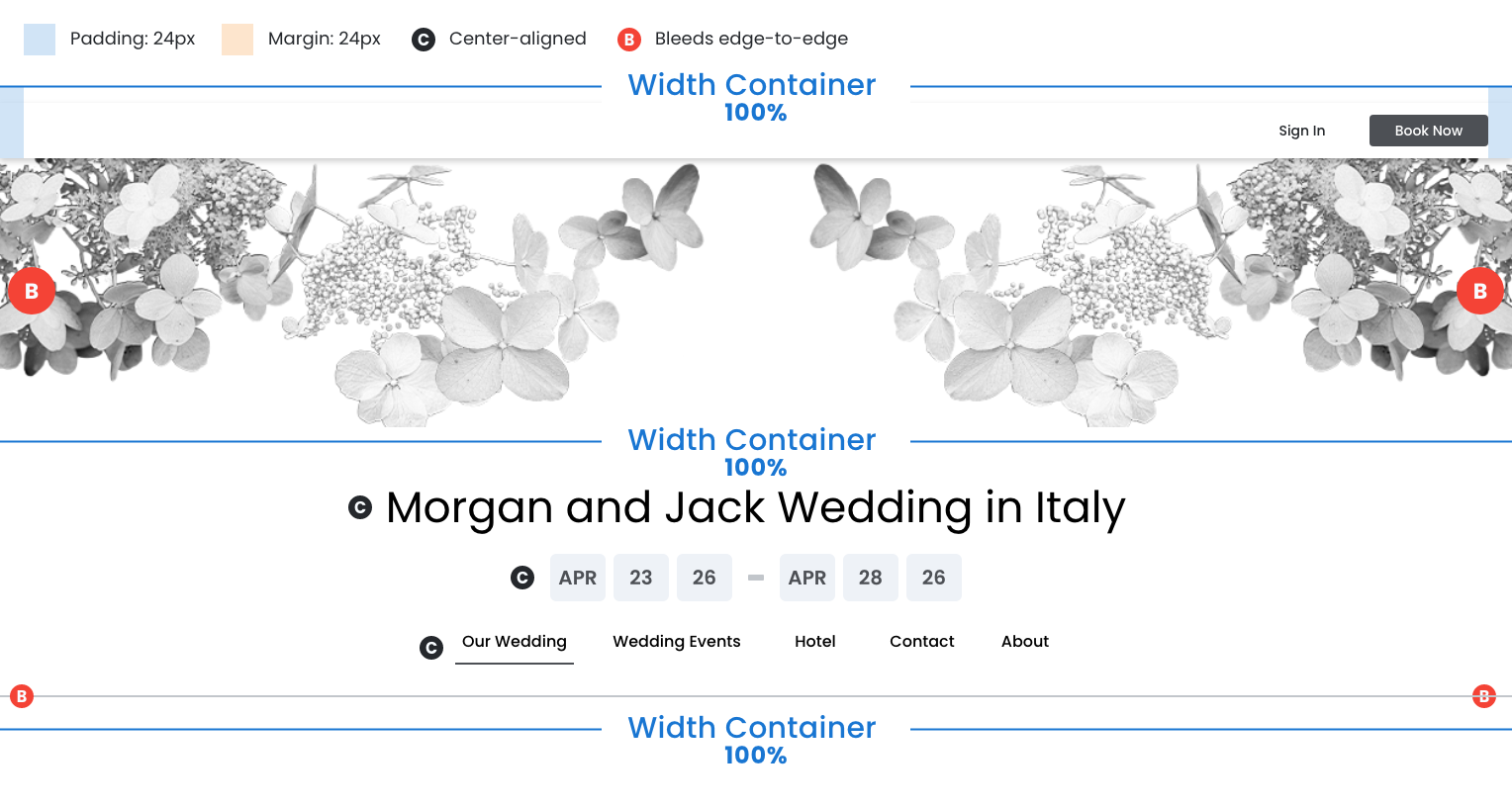
Top Utility Bar
- Container: 100% width
- Content: Also 100% width (spans full container)
- Padding: 24px left and right within the container
- Alignment: Right-aligned within the padded area
Visual Header
- 100% width container
- Decorative graphic bleeds edge‐to‐edge
Full‐Width Elements (100% width):
- Event Title Section (content center‐aligned)
- Date Range Display (content center‐aligned)
- Primary Navigation Menu (content center‐aligned)
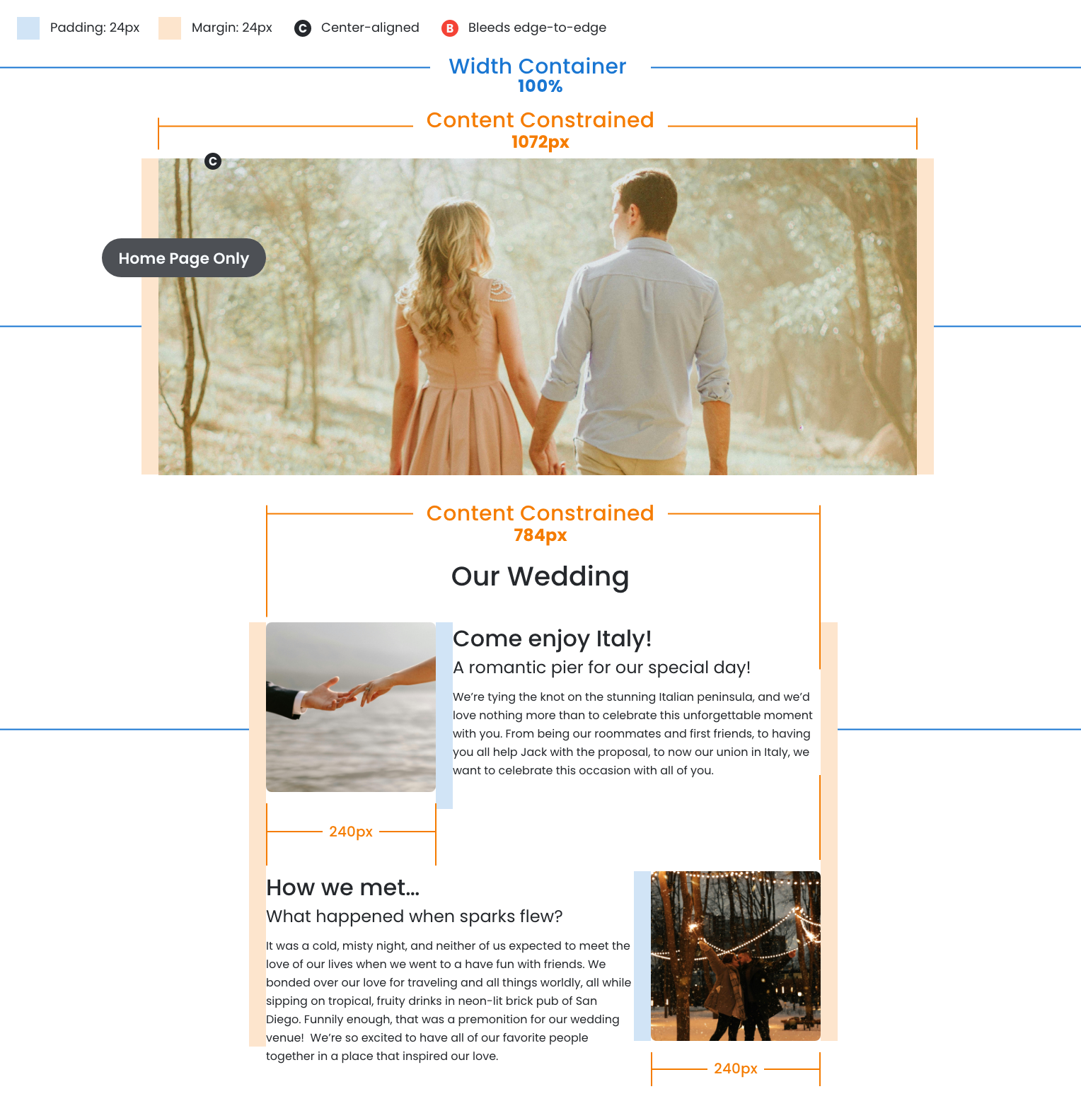
Main Image
- Home page only
- Container: 100% width
- Image: Constrained to 1072px maximum width
- Margins: 24px left and right (creates gutters)
See Dimension Callouts
Main Image (Home page only)
- Container: 100% width
- Image: Constrained to 1072px maximum width
- Margins: 24px left and right (creates gutters)
Content Area
- Container: 100% width
- Section with image/text combinations constrained to 784px max width
- Margins: 24px left and right (creates gutters)
See Dimension Callouts
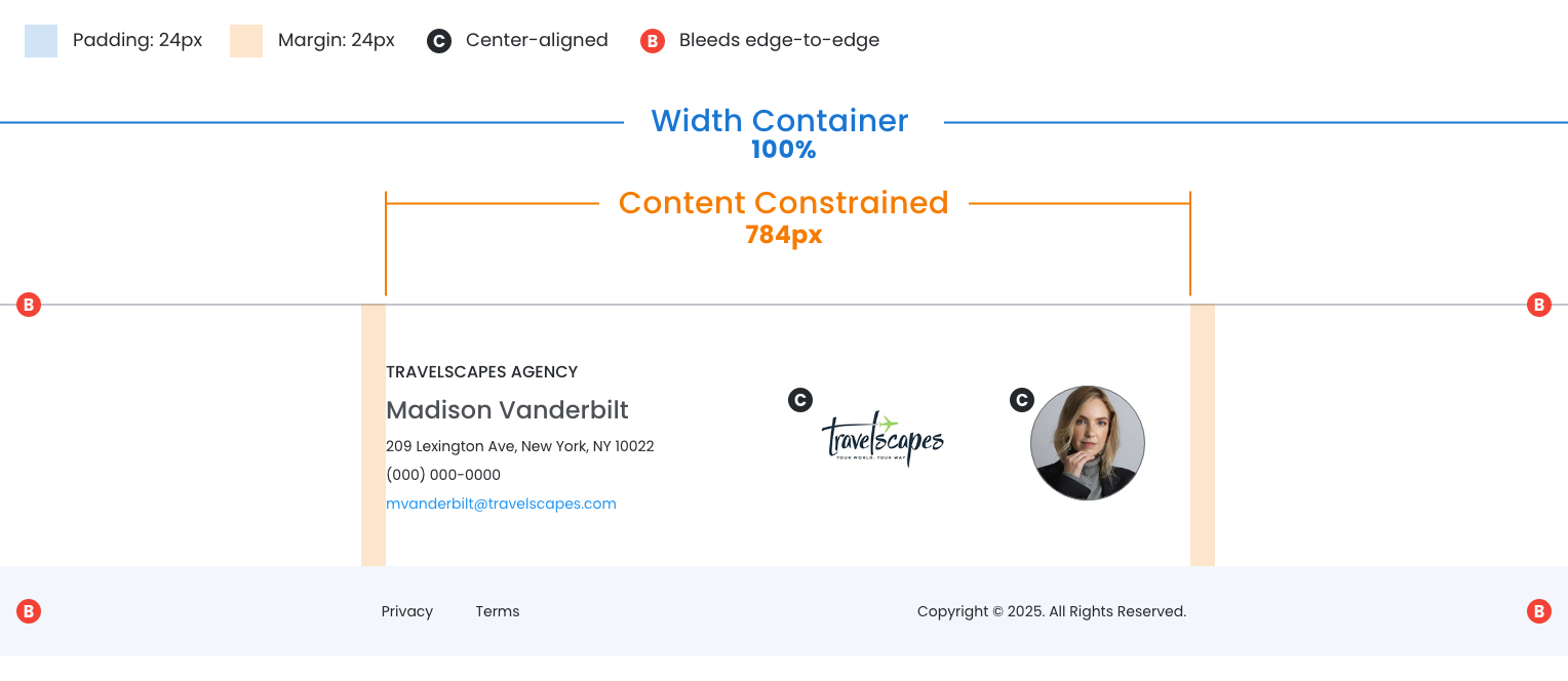
Footer
- Container: 100% width
- Contact info and branding constrained to 784px maximum width
- Margins: 24px left and right (creates gutters)
See Dimension Callouts
September 25th, 2025
Vertical Spacing Breakdown
Height Measurements
Precise vertical spacing is essential for maintaining the premium, luxury brand experience. Proper vertical rhythm creates the visual breathing room and sophisticated hierarchy that communicates quality and trustworthiness.
Header Structure
- Proper spacing around the visual header and nav creates immediate impact
- Consistent vertical spacing between menu items and call‐to‐action buttons
- Ensure the header maintains its appearance across desktop and mobile

Content Area Structure
Proper spacing helps organize complex information (the wedding story, images, and details) that feels elegant and easy to digest rather than cramped or chaotic.
- Proper spacing around the visual header and nav creates immediate impact
- Consistent vertical spacing between menu items and call‐to‐action buttons
- Ensure the header maintains its appearance across desktop and mobile

Footer Structure
- Proper vertical spacing ensures travel agent details are easily readable
- Well‐spaced footer elements provide visual closure that feels polished
