Header Structure
An immersive first impression while ensuring guests can easily navigate and take action.
In this page
October 8th, 2025
Component Overview
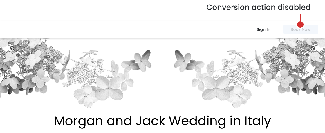
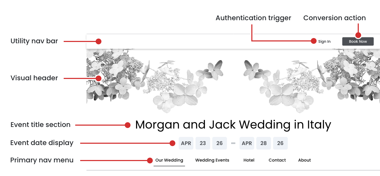
The header is a persistent element that appears across all pages of the event website, providing visual identity, navigation, and key event information. It consists of three main sections: Utility Navigation, Visual Header, and Primary Navigation.
1. Utility Navigation Bar
Position: Top, fixed above all content
Background: Solid color (white/light neutral)
Elements
- Sign In ‐ Left aligned in utility bar
- Book Now ‐ Right aligned in utility bar, darker background color
Purpose: Provides quick access to account page and primary conversion action
2. Visual Header
Position: Full-width banner below utility navigation
Theme Variations:
- Wedding: Floral arrangements, elegant botanicals, romantic elements
- Vacation: Beach scenes, tropical elements, adventure visuals
- Corporate: Professional patterns, abstract geometric designs, branded imagery
3. Event Title Section
Position: Centered vertically and horizontally over visual header
Features:
- Typography: Large, prominent display font
- Color: High contrast with background (typically black or dark gray)
- Responsive: Font size adjusts for mobile devices
4. Event Date Display
Position: Centered below event title
Features:
- Format: Month abbreviation + Day numbers with separator
- Example: "APR 23 26 ‐ APR 28 26"
- Style: Clean, modern typography in gray boxes/pills
5. Primary Navigation Menu
Position: Bottom of header section, below visual element
Background: White/light background with subtle border
Design Features:
- Horizontal layout on desktop
- Active page indicated with underline or border
- Responsive: Converts to hamburger menu on mobile
- Hover states for interactivity
View Design Specs
October 8th, 2025
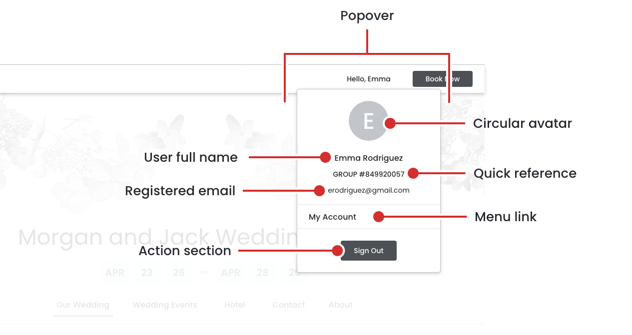
Authentication State
Signed In
The utility navigation adapts based on user authentication status, displaying different elements for signed‐out vs. signed‐in users.
1. Signed-In State (Authenticated)
- User Greeting Left aligned, replaces "Sign In" text
- Format: "Hello, [First Name]"
- Example: "Hello, Emma"
- Clickable/interactive element
- Visual indicator (subtle hover state or dropdown icon)
2. User Account Popover/Dropdown Menu
Trigger: Click on user greeting ("Hello, Emma")
- User Greeting Left aligned, replaces "Sign In" text
- Format: "Hello, [First Name]"
- Example: "Hello, Emma"
- Clickable/interactive element
- Visual indicator (subtle hover state or dropdown icon)
- Popover Structure:
- Circular Avatar/Initial
- User Full Name
- Group Identification
- Email Address
- Menu Link
- Sign Out button
View Design Specs

View Design Specs
October 8th, 2025
Conversion Flow State
Booking In Progress
User has clicked "Book Now" and is actively in the booking/checkout process.
Visual Change
- Appearance:
- Greyed out/faded
- No hover effects
- Cursor: not-allowed or default
View Design Specs