Color System
The Material Design color system will help us create a color theme that reflects our style.
In this page
Color Usage
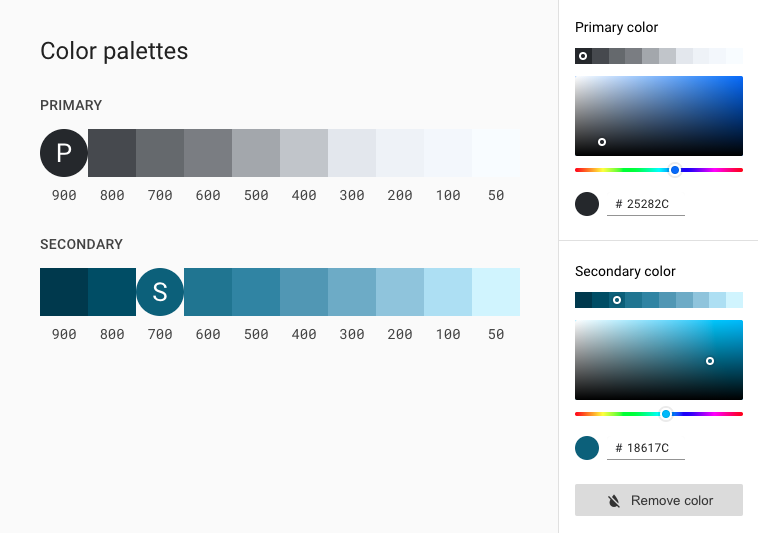
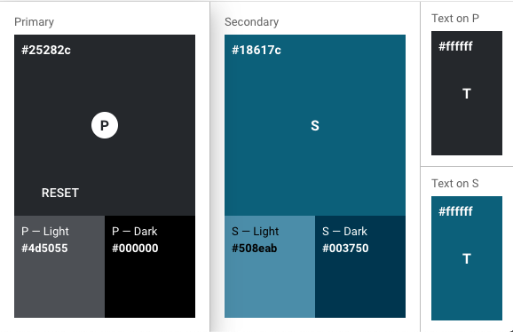
In this system, we select a primary and a secondary color to represent our brand. Dark and light variants of each color will be applied to the UI in different ways.
Primary and Secondary
Our primary color will display most frequently across our app's screens and components. The primary color will be used to make a color theme for our Classic Vacations webite, including dark and light primary color variants.
Color Variations
Color palettes are generated based on the primary and secondary colors. These palettes provide additional ways to use the primary and secondary colors. They include lighter and darker options to separate surfaces and provide colors that meet accessibility standards.