Connection Container
Scannable flight journey summaries with on‐demand detail access.
In this page
JIRA: CV‐43925November 3rd, 2025
Functional & Direct
Progressive Disclosure Component
The Connection Container displays summarized flight connection information within the Flight Card, allowing users to view journey overview at a glance or expand to see comprehensive leg‐by‐leg details. This component is designed to balance information density with usability, providing essential context by default while keeping detailed flight information just one click away. The component uses a "show/hide flight details" toggle link to transition between states.
November 5th, 2025
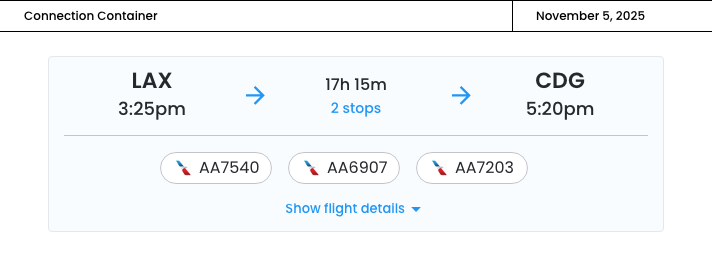
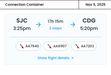
Collapsed State
In its collapsed state, the container shows departure/arrival times, airports, flight numbers, and total duration.
- Clean, scannable summary that mirrors the original design
- Flight numbers with airline logos at endpoints provide quick context
- The "show flight details" link with dropdown chevron is perfectly clear

November 5th, 2025
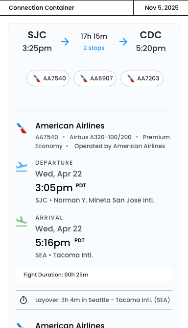
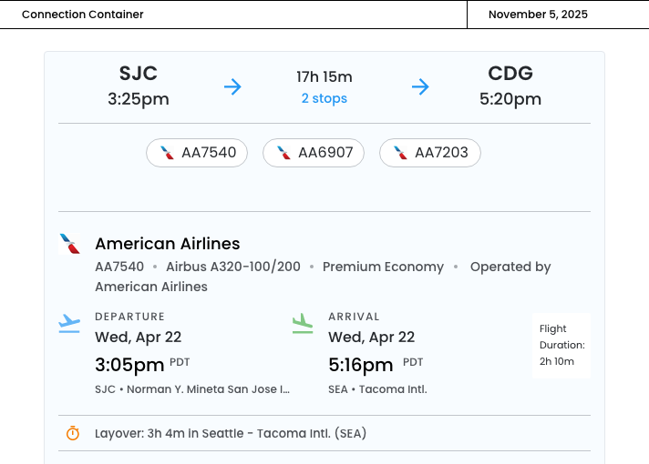
Expanded State
When expanded, users can access complete flight information including dates, airline details, aircraft type, operating carriers, layover durations, and timezone indicators.
- Information hierarchy ‐ The airline info is organized with clear separators
- Operated by info ‐ Clearly shows share arrangements in a subtle gray
- Smart date/time layout ‐ with timezone indicators are crucial for world travel
- Duration labels ‐ Right‐aligned "Duration: 2h 10m" keeps things organized
- Layover treatment ‐ The orange clock icon creates clear visual separation
- "Arrives Thu, Apr 23" in red ‐ Highlights the arrival date change

November 5th, 2025
Mobile‐Responsive
The following design adapts the two‐column departure/arrival desktop layout to a mobile‐responsive version.
Key mobile adaptations:
- Vertical Stacking
- The two-column departure/arrival layout becomes vertically stacked on mobile
- This prevents horizontal cramping and ensures all information is readablee
- Visual Indicators
- Blue departure icon and green arrival icon with labels
- Helps users quickly distinguish departure from arrival when stacked
- Color coding reduces cognitive load
- Optimized Information Hierarchy
- Times are larger for quick scanning
- Metadata wraps onto multiple lines instead of being inline
- Airport names display fully without truncation
- Flight duration moves to a dedicated gray card at the bottom of each leg
Collpased
Expanded